
Selecting the perfect typeface for a sign can feel overwhelming given the sheer number of options available. Yet a few guiding principles can simplify the decision and ensure your finished piece looks polished, professional, and perfectly suited to its purpose. Here are the key factors to consider before committing to any font.
1. Consider Your Audience
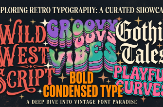
Who will be reading your sign? A wedding audience expects elegance and romance — a calligraphy script is the natural choice. A retail customer needs to absorb information at a glance, so a clean sans-serif or bold display face will serve you far better. A child-oriented audience, on the other hand, responds to playful, bouncy letterforms that feel approachable and fun. If you’d like to dive deeper into audience-appropriate typography, our guide to the best fonts for making signs breaks down the decision by context and setting.
2. Think About Distance
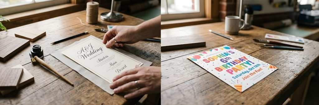
How far away will your viewers be standing? For signs that must be legible from across a parking lot or down a corridor — storefront facades, directional wayfinding, event banners — prioritize bold, high-contrast fonts like Ragillia, Amsterdam Four, or Castleton. For intimate, close-up applications such as table numbers, desk plaques, or place cards, more delicate scripts like Mistrully or Gloriant Script can shine without sacrificing readability.
3. Match the Medium
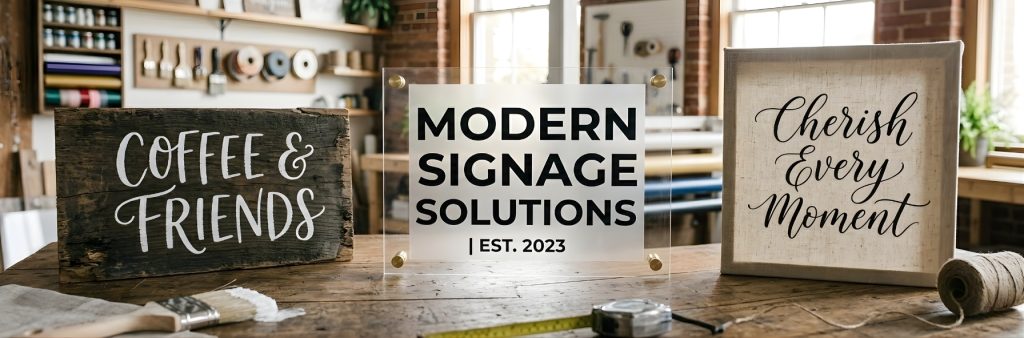
The material your sign is crafted from should play a direct role in your font selection. Rustic wood signs pair naturally with hand-lettered and farmhouse-inspired typefaces — you’ll find an extensive roundup of those styles in our collection of the best farmhouse fonts for Cricut.
Acrylic and glass signs, by contrast, look their sharpest with clean, modern typography that echoes the sleekness of the material itself. Canvas and fabric signs tend to be the most versatile, working equally well with flowing scripts and structured display faces.
4. Pair Fonts Strategically
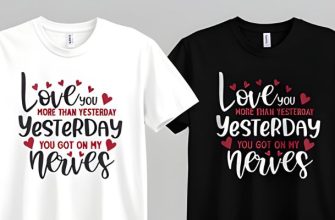
Many of the most polished signs rely on a two-font system: a decorative or script font for the headline and a simple, understated font for supporting details. A classic pairing — one that rarely disappoints — is a flowing script set against a geometric sans-serif.

If you’re working with hand-lettered or calligraphic styles and want more pairing inspiration, our roundup of the best script fonts for Cricut includes plenty of combinations worth exploring.
5. Test Before You Commit
Always type out your exact wording in a font before purchasing or locking in your design.

Some typefaces look gorgeous in curated preview images yet stumble with certain letter combinations — awkward ligatures, clashing ascenders, or spacing issues that only surface with your specific text. A quick mock-up can save you hours of frustration down the line.
6. Check Licensing
If you’re producing signs for sale, confirm that your font license explicitly covers commercial use. All fonts on Creative Fabrica ship with clear licensing information, so take a moment to verify that your intended use — whether personal, commercial, or extended commercial — is covered before you begin production.

Choosing the perfect font for a sign is one of the most consequential design decisions you’ll make. The right typeface doesn’t merely display words — it communicates emotion, establishes atmosphere, reinforces brand identity, and commands attention in ways no other single design element can rival.
Whether you’re a professional sign maker, a small business owner designing your own storefront, a wedding planner assembling a cohesive visual identity, or a Cricut enthusiast cutting vinyl for the first time, thoughtful font selection will elevate your craft and help you produce signs that make people pause and look twice.
Happy sign-making — and may your typography always be on point.